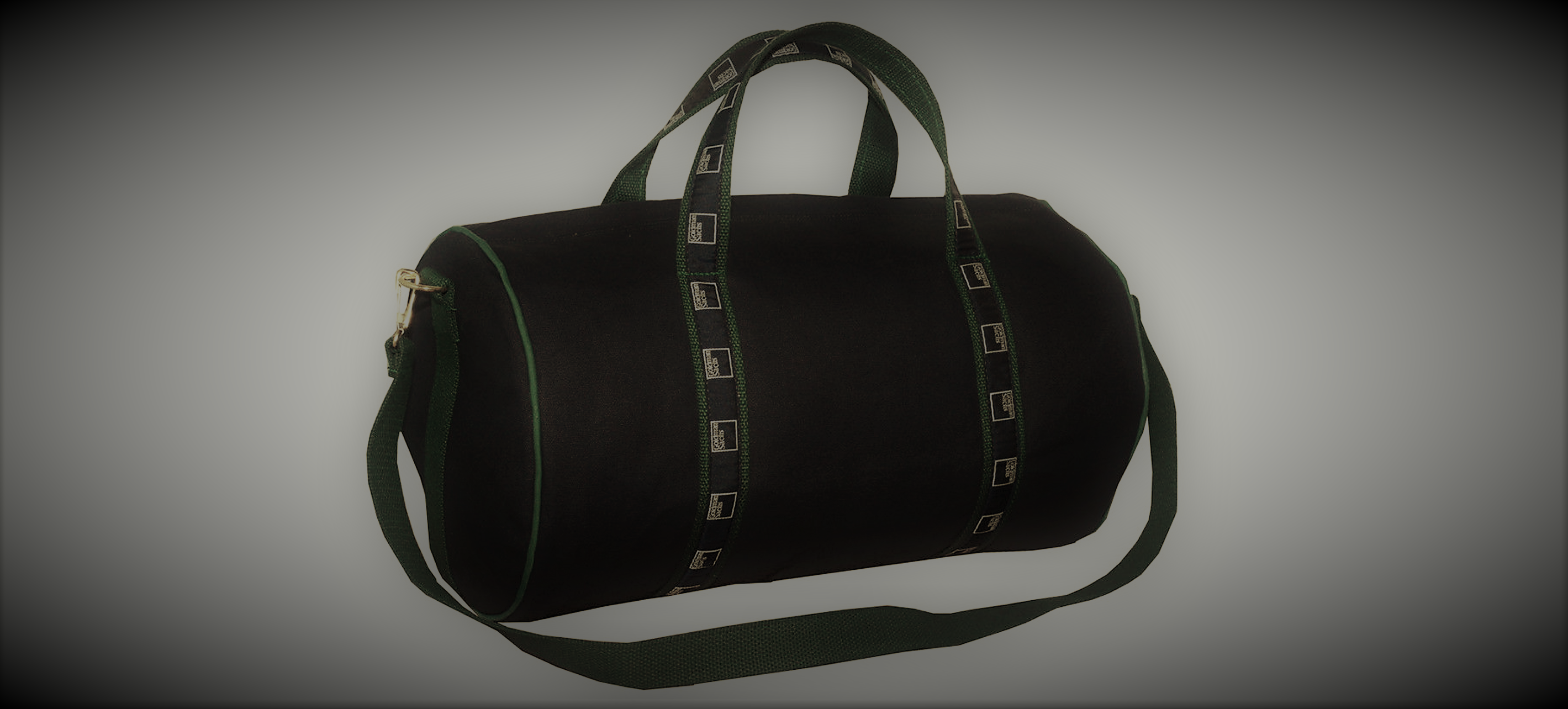
What is a Banker Bag?
For those unfamiliar with the iconic banker duffle bag pictured below, let me education you: it is the ultimate status symbol in the investment banking world. While nothing more than a glorified branded canvas bag, it is highly coveted in the banking world. My wife unwittingly offended the sacred right of brokers when she, as a recruiter for a notable investment bank, comondeered one from the swag pile. Her brother, who also worked in the industry, was appalled that she was using the duffle as a lowly gym bag and corrected her naivety. He, like others in the industry, was obsessed with getting one.
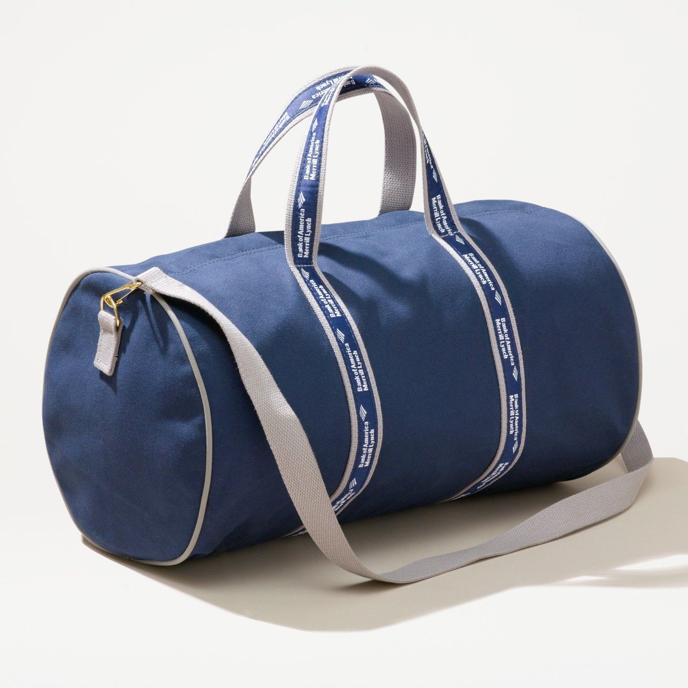
I decided to get this brother-in-law a banker bag for Christmas but my wife no longer had access to the swag pile. I soon found what makes these bags so coveted – they are very exclusively distributed and with this scarcity comes an extremely high price on the secondary market. I was abashed to see prices as high as $400 for a basic duffle on eBay and other parts of the internet! I found out there is one particular company that makes these bags, Scarborough and Tweed, and there are really no knock offs. Scarborough & Tweed has a very distinct style: the canvas bags are most often blue, but sometimes tan or green, and do not have pockets. Most importantly, the webbing handles are proudly inlayed with the banks logo on a ribbon. I called the company and bluffed my way through a story about working for credit union with a very refined gentleman salesperson. Notwithstanding the minimum order requirements, the price per bag was north of $65. I didn’t purchase directly from Scarborough & Tweed or eBay. After much searching, I did find a corner of the internet that could sell one at price within the holiday budget.
Two decades after Scarborough & Tweed launched its canvas duffle bag, dubbed the “deal bag,” investment bankers, brokers and fund managers continue to carry the satchel, which has become a badge of honor on Wall Street. - Scarbourgh and Tweed Website
Using the Bag’s Price as a Proxy for the Banks Reputation
Enough backstory on the bags themselves - now you know - so keep an eye out next time you are at an airport for a well-dressed travelling banker. Recently, while discussing with a colleague, I thought the secondary market price (e.g., eBay’s price, the bags are generally given away for free by the banks) might be a good indicator of the bank’s reputation. For example, when Wells Fargo had the accounts scandal, did it become less prestigious and hence the price of the bags fall? Reputation might be measured by NPS or employee engagement scores. The bags are pretty specific to investment bankers so I’m not sure if this would give any insight into the bank as a whole – only this small segment’s perceptions if any. If anyone has access to these scores to correlate with my findings, please share!
I found eBay posts prices of sold items for 3 months. I wish the data would go back quite a bit longer so we capture long term trends and major bank events. Since there is a limited number of sold bags and some postings don’t apply, I just copied the data by hand (instead of writing a webscrape). I had to make some judgement calls as to what to include or not.
The Findings
Since the data isn’t very deep (only 50 completed sales), I decided to do my best to make an interesting graphic. So without further ado here it is:
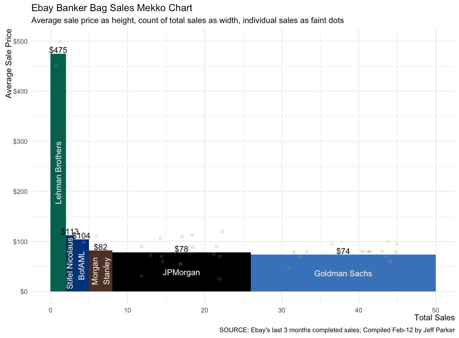
This type of chart is called Marimekko or just Mekko chart. Mekko graphs are different from normal bar charts in that they use two channels to convey data: the height and also the width of bars. While not immediately intuitive (because they are uncommon), I feel it tells a really clear story with the data. There is an obvious relation between supply and price. The more the supply (width) the lower the average price (height). Also Lehman Brothers is clearly the most valuable. I also include faint dots as the actual sales scattered across the bars to get a sense of the distribution. Is this distracting, useful or interesting? I’d love to hear thoughts on how this can be improved so feel free to share in the comments below.
The Code
# Libraries
library(tidyverse)
library(lubridate)
library(scales)

# Get data and fix a few columns
bags <- read_csv('https://raw.githubusercontent.com/jeffreyxparker/jeffreyxparker.github.io/master/_data/banker_bags.csv') %>%
  mutate(total_price = price + shipping,
         date_sold = mdy(date_sold)) %>%
  select(bank, date_sold, total_price)

# Organize data for plotting purposes
bags_summary <- bags %>%
  group_by(bank) %>%
  summarise(sales = n(),
            average_price = mean(total_price)) %>%
  arrange(desc(average_price)) %>%
  mutate(width_max = cumsum(sales),
         width_min = width_max - sales,
         width_ave = ((width_max - width_min)/2)+width_min)
bags <- bags %>%
  left_join(bags_summary)
bags_summary[4,1] <- "Morgan\nStanley"

# Plot
ggplot(bags_summary) +
  geom_rect(aes(xmin = width_min,
                xmax = width_max,
                ymax = average_price,
                ymin = 0,
                fill = bank),
            alpha = 1) +
  geom_text(aes(label = paste0("$",round(average_price,0)),
                y = average_price + 7.5,
                x = width_ave)) +
  geom_text(aes(label = bank,
                y = average_price/2,
                x = c(1,2.5,4,6.5,17,38),
                angle = c(90,90,90,90,0,0)),
            color = "white") +
  geom_point(data = bags, aes(x = jitter(width_ave,sales),
                              y = total_price,
                              color = bank),
             alpha = .2) +
  labs(x = "Total Sales",
       y = "Average Sale Price",
       title = "Ebay Banker Bag Sales Mekko Chart",
       subtitle = "Average sale price as height, count of total sales as width, individual sales as faint dots",
       caption = "SOURCE: Ebay's last 3 months completed sales; Compiled Feb-12 by Jeff Parker") +
  theme_minimal() +
  theme(legend.position = "none",
        axis.title = element_text(hjust = 1),
        axis.title.x = element_text(margin = margin(t = 0,
                                                    b = 0.8 * 5/2)),
        axis.title.y = element_text(angle = 90,
                                    margin = margin(r = 0,
                                                    l = 0.8 * 5/2))) +
  scale_fill_manual(values = c("#00604E","#003461","#01327B","#4F2F24","#000000","#3971b9")) +
  scale_y_continuous(labels = dollar)