I like impactful graphics – especially in news media. However, my favorite news outlet, the KSL app struggles in the this department. I have noticed the KSL app experimenting with graphics created in digital platforms such as Tableau and Graphiq. The data visualizations include good data and are useful in context, but there is massive room for improvement. Here is my critique a graphic with my attempt to improve them.
Background
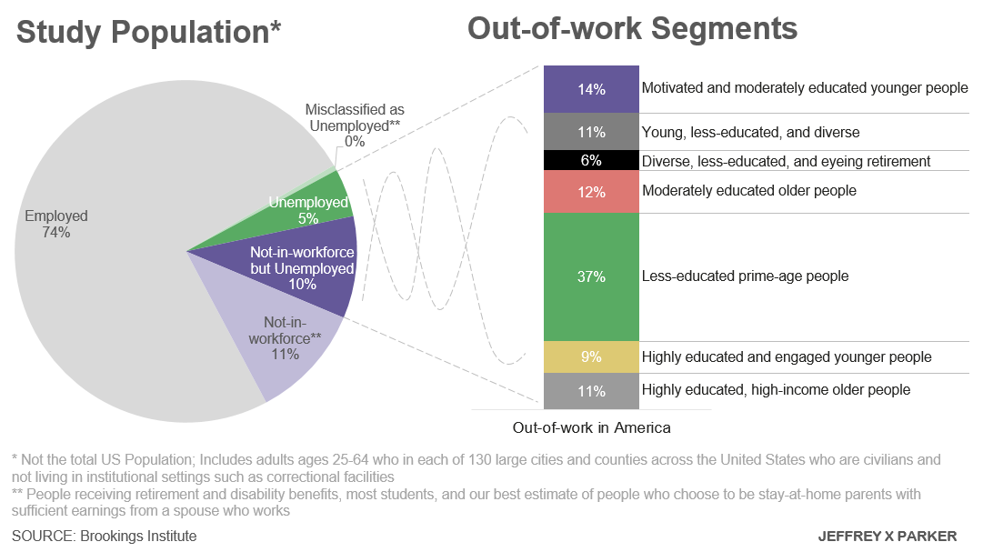
the unemployment rate is extremely low as the economy is very strong in Utah. So KSL (via Deseret News) published an emotional and eye-catching piece titled “Who is unemployed in America? The answer might surprise you.” The story is really more of a summary of a Brooking Institute study. The article outlines how traditional measures of unemployment do not account for individuals not working because they are too discourage to search, disabled, elderly and those with sufficient income from a spouse. The point is that a high number of potentially employable people are in fact unemployed, illustrated by the following pie chart. There are so many problems with it I don’t know where to begin. Have a good look at it before reading on.
Color
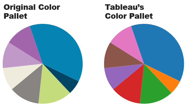
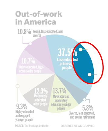
Like most pie charts, this one uses color to differentiate different slices. But the fact that there are different shades of the same colors appears to mean something. At first, I thought a color represented “education” and a shade represented “age” – mixing channels with the same encoding would be a terrible idea. But looking closer, that is not the case. The poor color choices are probably just from using a paired color pallet incorrectly used. Speaking of the pallet, while it is pleasing to the eye, it is a poor choice. The colors cannot even be blamed on being Deseret News’ corporate colors. Blue, purple and green are all close in the color wheel and not complementary. Not to mention, green will cause issues for colorblind viewers. Also with such bold colors, the grey categories fall to the background despite being among most important categories. Consider my rendition below removing everything but the colors. Tableau’s colors are discrete, while the graphics paired colors blend together.
Deliberately Hiding Data
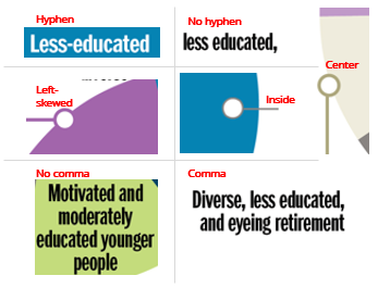
It looks like some designer quickly combined two categories in “less-educated, prime-age people.” The designer did not even bother to cover their tracks – there is still lines for the former labels leading off the image. The font size and grammar is not consistent with the rest of the graphic. Deception is a cardinal sin for both journalists and visualization designers.
Pie Chart
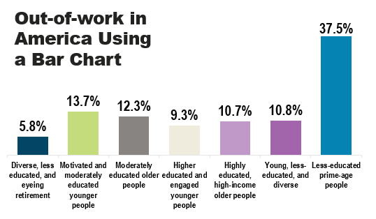
Most data visual professionals generally frown on pie charts. My opinion is they have a time and place. Pie charts should only be used to illustrate the proportionality of different categories. Remember the purpose of this chart is to illustrate “there are more categories of people that are not working besides those officially classified as ‘unemployed.’” The real story here is not the proportion of slice, but rather just the categories themselves. Since this is the case, the designer could have just listed out the categories as bullets with the same effect. Pie charts also convey completeness, but these categories are anything but complete. Since the labels includes factors about age, education, income, motivation and diversity, these slices are clearly cherry-picked from a broader group of segments. As it turns out, the Brookings Institute defined these segments using cluster analysis. The gist of the article implies that these segments are larger than expected, so maybe this graph should try to illustrate scale using a bar graph. Clearly, my rendition still needs some work (37.5% of less-educated, prime-age people are NOT out-of-work), but I tried to keep all the same aesthetics.
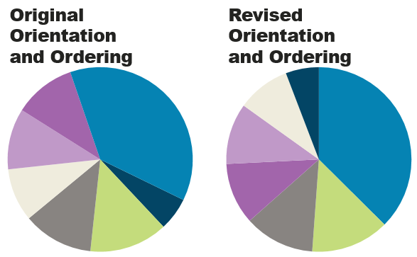
Ordering, Position and Count of Slices
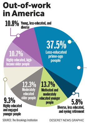
The general rule for pie charts is to start with the largest slice at 12:00 o’clock and order largest to smallest. Not the case here in both respects. Perhaps different ordering would be justified if similar slices are purposely following other slices like grouping all the “less-educated” slices by each other. There is no rhyme or reason to the ordering of these slices. Lastly, there is seven slices in this chart. Another general rule is pie charts should have no more than four.
Fonts
Sometimes the labels center the text, sometimes labels left-justify the text, sometimes the labels right-justify the text. Best design practice to just to keep text consistent. In this and most cases left-justified is ideal. I think the designer was trying to fit everything in a square window for the graphic. Also the label for this has a larger font size than the others – probably an accident from superimposing a label of combined segments. Both white, grey and black fonts are used. The font is too narrow and nearly unreadable. Comparing “DESERET NEWS GRAPHIC” to the “SOURCE” text: it too large, in a different font, all caps and not aligned. Perhaps this is to distinguish Deseret News as the creator of the chart, but due to the quantity of errors, Deseret News might not want to claim this graphic.

Labels
Besides just problems with the font, the labels have other issues. First of all the leader lines. Some lead to the center of the edge of the slice, one leads off-center edge, and two (left-overs from combined slices that do not even have labels) lead inside the slice. Even the text of the labels does not follow a standard format – some labels begin with the age qualifier, some with “diversity” qualifier, some with education and some with motivation. Clearly, this graph could not be more random if it was intended. We can forgive the circles on the leader lines but there are several grammar mistakes in the text – from a published newspaper! “Less-educated” is hyphenated in one instance and not in another. Sometimes “and” is used between the qualifiers and sometimes not, which brings up a scenario with an oxford comma. Not to criticize Deseret New’s grammar because this cluster names from the Brookings Institute, but there are many inconsistencies.
Decimal Places and Math
As I review the categories, I realized there is no legend for age, education, motivation etc. How old is “older people?” 45-60? And how does that compare to “eyeing retirement?” 45-60? It is excessive to have a decimal digit for this graph. Viewers do not care about that level of detail. Perhaps the extra digit is to add “scientific” credibility to chart. However, all credibility is lost when the slices add up to 100.1%!
| Category | Value |
|---|---|
| Diverse, less educated, and eyeing retirement | 5.8% |
| Motivated and moderately educated younger people | 13.7% |
| Moderately educated older people | 12.3% |
| Higher educated and engaged younger people | 9.3% |
| Highly educated, high-income older people | 10.7% |
| Young, less-educated, and diverse | 10.8% |
| Less-educated prime-age people | 37.5% |
| Total | 100.1% |
Conclusion
In this post, I do not really want to get into how the author of the Deseret News article also bungled the summary of the Brooking Institute study. I as read through the report to find the data to recreate this chart, there are several subtle differences the article misses. Additionally, having done cluster analysis on survey data extensively, I have several issues with the Brooking Institute’s methodology. However, the Brooking Institute does has a very nice dynamic data visualization that is worth checking out. It clearly explains their findings in four moving bar charts, utilizing color efficently. They also explain mixed demographics behind cluster analysis. I am impressed.
It is dangerous to publish data visualization without understanding the analysis conducted as I believe this article has done. Ultimately, the Deseret News designer downloaded the data and dropped it into a pie chart without much thought. While probably not intentional, the visualization is dangerously misleading and sensational. Anyways, the ultimate goal of the article and accompanying chart (in my opinion) is to illustrate there are other groups of people not included in the unemployment rate, that possibly should be. Here is my revised chart. You will notice I have broken some of the rules I just outlined (orientation, order, number of slices, paired pallet), but with good reason each time. Let me know what you think in the comments.